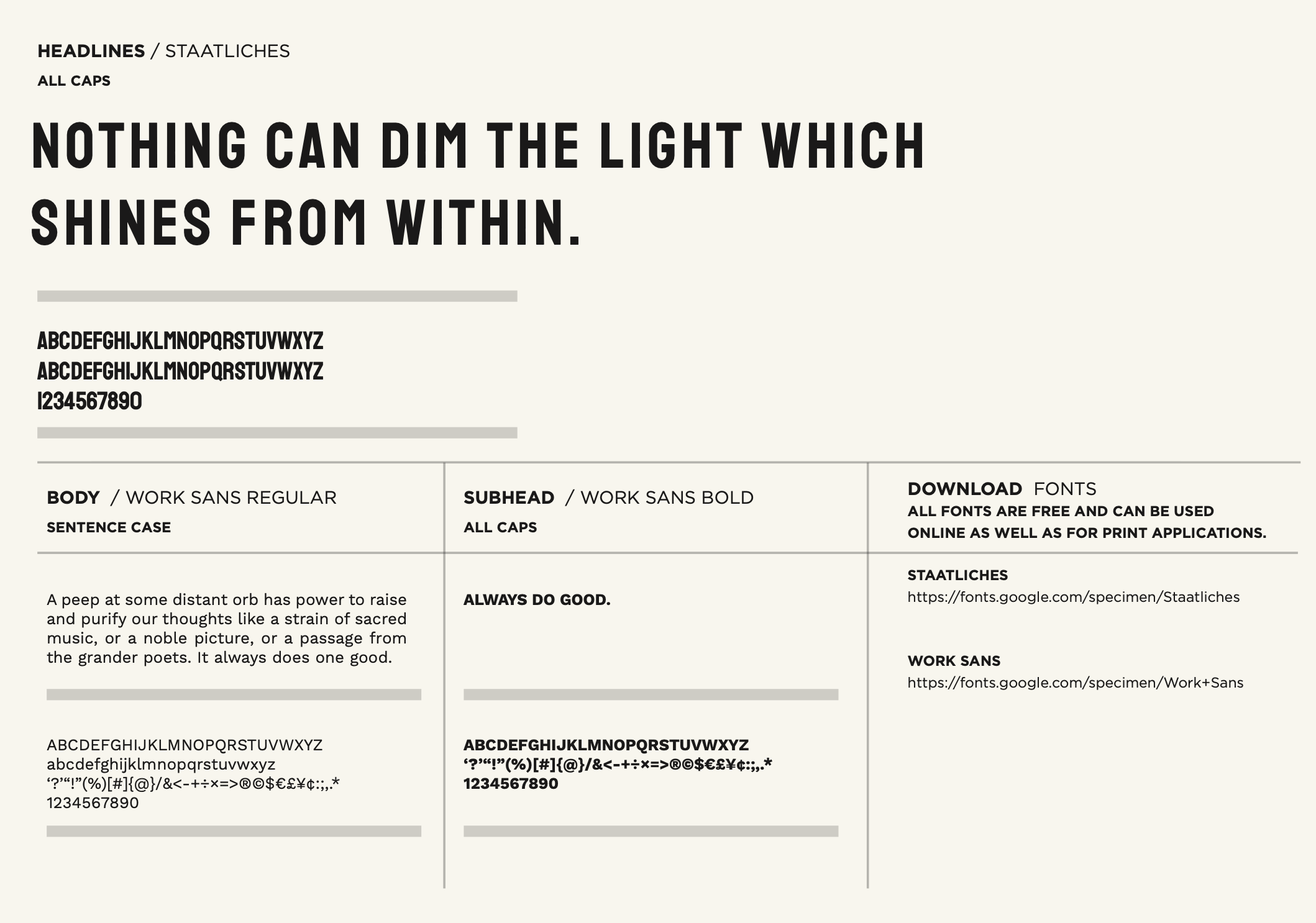
Ever feel like your brand’s look is a bit… messy? Like a drawer full of mismatched socks? Often, the culprit is too many fonts! We get it, there are so many cool fonts out there. But when it comes to your brand, less really is more. In fact, sticking to just three fonts can make a huge difference.
Think of it like this:
Your Primary Font: The Star of the Show
This is your brand’s main voice, your primary font. It’s the font you’ll use most often for headlines, important titles, and your logo. Choose one that really fits your brand’s personality. Is your brand serious and professional? Fun and playful? Your primary font should say it all! When people see this font, they should instantly think of you. Consistency here is key!
Your Secondary Font: The Reliable Supporter
Next up is your secondary font. This font works hand-in-hand with your primary font. You’ll use it for things like the main text in your brochures, website paragraphs, or longer descriptions. It should be easy to read and complement your primary font without trying to steal the show. Think of it as the reliable friend who always has your back. The goal is to create a seamless reading experience.
Your Accent Font: A Pop of Personality
Finally, we have your accent font. This is where you can have a little fun! Your accent font is used for special highlights, like a call to action button, a small quote, or a unique graphic element. It adds a little sparkle and draws attention to important parts. But remember, use it sparingly! Too much accent can be overwhelming. A little bit of this unique font goes a long way to add a nice touch.
Why Three is the Magic Number
- Looks Pro: Using only a few carefully chosen fonts makes your brand look super professional and put-together. It shows you’ve thought about your design.
- Easy to Remember: When you limit your fonts, your brand becomes easier for people to recognize and remember. It creates strong visual consistency.
- No More Confusion: Too many fonts can make your message hard to understand. Limiting your fonts helps keep your brand’s voice clear and strong. Your audience won’t be confused about what to focus on.
- Consistency Across Everything: From your website to your printed flyers, using the same primary, secondary, and accent fonts makes everything look like it belongs together. This builds trust and strengthens your brand image.
So, take a look at your brand’s fonts. Are you using too many? If so, it’s time to simplify. Pick your amazing primary font, your dependable secondary font, and your fun accent font. Your brand (and your audience) will thank you for the beautiful, consistent look! Less truly is more when it comes to fonts.

